Embedding HTML components in forms — How to use custom HTML blocks
...

Introduction
Workspace and Custom HTML Blocks
This article explains how to extend the ERPNext workspace with custom HTML blocks and customize the UI to a modern style, using nine implementation examples.
A Workspace is the user home screen that opens first when you log in to ERPNext.
It's easiest to understand it as a gateway and bulletin board for your apps, where you can place shortcuts to frequently used screens, as well as numbers, graphs, and notifications all in one place.
This time, we'll implement custom HTML in this workspace.
The "Custom HTML" block allows you to express things that are difficult to achieve with standard HTML and CSS alone.
This time, we tested "how far we could go" while implementing this custom HTML.
 (The verification screen for the implemented workspace is Here )
Standard Block
The workspace also includes the following standard blocks (representative examples):
- Shortcuts (paths to /app/○○)
- Charts/Reports (Line graphs, bar graphs, list view)
- KPI Card (Numerical Value)
- Links/Cards (Groups of related pages)
- For layout purposes such as headings/separators.
For more details Official documentation ⤴ This may also be helpful:
Conclusion of Verification
To state the conclusion of the verification first,
ERPNext's expressive capabilities are far more flexible than you might imagine. It can implement most of the features you'd typically see in web applications!
By reading this article
- You can find out the range of what can be expressed in the ERPNext UI.
- You'll learn about custom procedures for your workspace. (← This isn't mentioned in the official documentation, and it can be a bit tricky to figure out 💦)
Implementation Examples (9 types): Expanding Expression with Custom HTML
So, there are nine expressions we tried out this time. With a focus on a modern UI that prioritizes readability, we implemented it using a minimal configuration and easily reusable types. Let's look at them one by one.
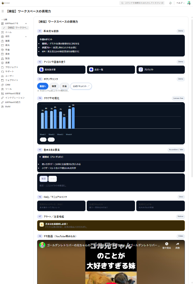
#1 Basic formatting (headings/cards/lists)
This is the "foundation" that dramatically improves readability.
**🔶Success! **
It can be used for a variety of purposes, such as team bulletin boards and short notes on work procedures.
🔷Implementation Code
# HTML
<div class="mhx1-wrap">
  <div class="mhx1-card">
    <div class="mhx1-head">
      <h3 class="mhx1-title">チーム掲示板</h3>
      <span class="mhx1-badge" id="mhx1-badge">今月</span>
    </div>
    <p class="mhx1-lead">今週のポイント</p>
    <ul class="mhx1-list">
      <li><strong>棚卸し</strong>:ドラフト伝票を先に整理</li>
      <li><strong>承認フロー</strong>:差戻し時はコメント必須</li>
      <li><strong>KPI</strong>:確度更新は金曜まで</li>
    </ul>
  </div>
</div>
# CSS
.mhx1-wrap{font-family:system-ui,"Noto Sans JP",sans-serif;color:#111}
.mhx1-card{background:#fff;border:1px solid #e5e7eb;border-radius:14px;padding:14px;box-shadow:0 1px 2px rgba(0,0,0,.04)}
.mhx1-head{display:flex;align-items:center;gap:.5rem;margin-bottom:.5rem}
.mhx1-title{margin:0;font-size:1.1rem;font-weight:800}
.mhx1-badge{font-size:.75rem;padding:.2rem .5rem;border-radius:999px;background:#eef2ff;color:#3730a3;border:1px solid #c7d2fe}
.mhx1-lead{margin:.25rem 0 .4rem;font-weight:700}
.mhx1-list{margin:.2rem 0 0 1rem;padding:0}
.mhx1-list li{margin:.25rem 0}
@media (prefers-color-scheme:dark){
.mhx1-wrap{color:#e5e7eb}
.mhx1-card{background:#0b1220;border-color:#1f2937}
}# JavaScript
(() => {
const el=document.getElementById('mhx1-badge');
if(el){const d=new Date();el.textContent=`${d.getFullYear()}年${d.getMonth()+1}月`;}
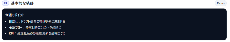
})();#2 Icons and Images (Tiles + Image Grid)
Intuitive and easy to press. Perfect decoration for entrance pathways.
**🔶Success! **
It can be used for a wide range of purposes, such as shortcuts to frequently used screens (/app/...) and horizontal banners for announcements.
🔷Implementation Code
<div class="mhx2-wrap">
  <div class="mhx2-tiles">
    <a class="mhx2-tile" href="/app/sales-invoice"><span class="mhx2-ico">🧾</span><span>販売請求書</span></a>
    <a class="mhx2-tile" href="/app/item"><span class="mhx2-ico">📦</span><span>品目一覧</span></a>
    <a class="mhx2-tile" href="/app/project"><span class="mhx2-ico">📁</span><span>プロジェクト</span></a>
  </div>
  <div class="mhx2-imgs">
    <img src="/files/sample-banner.png" alt="お知らせ" loading="lazy">
    <img src="/files/sample-thumb.png" alt="新機能" loading="lazy">
  </div>
</div>.mhx2-wrap{font-family:system-ui,"Noto Sans JP",sans-serif}
.mhx2-tiles{display:grid;grid-template-columns:repeat(auto-fit,minmax(160px,1fr));gap:10px;margin:.5rem 0 1rem}
.mhx2-tile{display:flex;align-items:center;gap:.5rem;padding:.65rem .8rem;border:1px solid #e5e7eb;border-radius:12px;background:#fff;color:#111;text-decoration:none;transition:transform .08s,box-shadow .12s}
.mhx2-tile:hover{transform:translateY(-1px);box-shadow:0 4px 10px rgba(0,0,0,.06)}
.mhx2-ico{display:inline-flex;align-items:center;justify-content:center;width:28px;height:28px;border-radius:8px;background:#f5f7ff}
.mhx2-imgs{display:grid;grid-template-columns:repeat(auto-fit,minmax(200px,1fr));gap:8px}
.mhx2-imgs img{width:100%;height:auto;border-radius:10px;border:1px solid #e5e7eb}
@media (prefers-color-scheme:dark){
.mhx2-tile,.mhx2-imgs img{border-color:#1f2937}
.mhx2-tile{background:#0b1220;color:#e5e7eb}
}(() => {
document.querySelectorAll('.mhx2-imgs img').forEach(img=>{
img.addEventListener('error',()=>{img.style.display='none';});
});
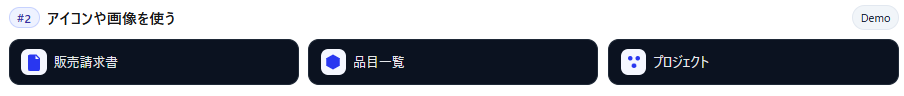
})();#3 Buttons and Links (Internal / External)
A basic set for navigation that prevents you from getting lost. Prioritization can be expressed using color variations.
**🔶Success! **
It can be used for frequently used main module wiring such as manufacturing, purchasing, and inventory.
Implementation Key Points
- Inside
/app/...External tabs are accessed via the +↗︎ symbol. - Rounded corners + light shadow create a "pressable" look.
🔷Implementation Code
<div class="mhx3-wrap">
  <div class="mhx3-row">
    <a class="mhx3-btn" href="/app/製造" data-internal="true">製造へ</a>
    <a class="mhx3-btn ghost" href="/app/buying" data-internal="true">購買</a>
    <a class="mhx3-btn ghost" href="/app/stock" data-internal="true">在庫</a>
    <a class="mhx3-btn outline" href="https://docs.erpnext.com/" target="_blank" rel="noopener">公式ドキュメント ↗︎</a>
  </div>
  <p class="mhx3-note">外部リンクは新しいタブで開きます。</p>
</div>.mhx3-wrap{font-family:system-ui,"Noto Sans JP",sans-serif}
.mhx3-row{display:flex;flex-wrap:wrap;gap:.5rem}
.mhx3-btn{display:inline-flex;align-items:center;justify-content:center;padding:.55rem .9rem;border-radius:999px;font-weight:600;text-decoration:none;border:1px solid #1f6feb;background:#1f6feb;color:#fff;box-shadow:0 2px 6px rgba(31,111,235,.25)}
.mhx3-btn.ghost{background:#f3f4f6;border-color:#e5e7eb;color:#111}
.mhx3-btn.outline{background:#fff;color:#1f2937;border:1px solid #cbd5e1}
.mhx3-note{color:#6b7280;font-size:.85rem;margin:.35rem 0 0}
@media (prefers-color-scheme:dark){
.mhx3-btn.ghost{background:#0b1220;border-color:#1f2937;color:#e5e7eb}
.mhx3-btn.outline{background:#0b1220;border-color:#1f2937;color:#e5e7eb}
}<script>
(() => {
document.querySelectorAll('.mhx3-btn[data-internal="true"]').forEach(a=>{
a.addEventListener('click',(e)=>{
if(e.metaKey||e.ctrlKey||e.shiftKey||e.altKey||e.button!==0) return;
const href=a.getAttribute('href');
if(window?.frappe?.router?.push && href){ e.preventDefault(); window.frappe.router.push(href); }
});
});
})();
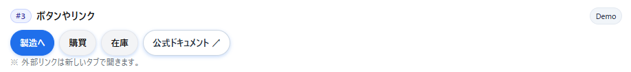
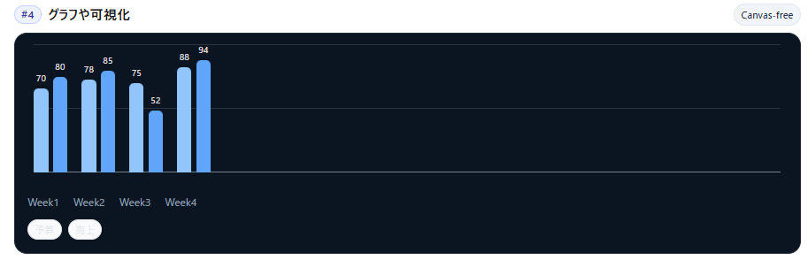
</script>#4 Creating a bar graph using only CSS (Visualization of ERPNext workspace)
Lightweight and fast. This graph is effective for rough comparisons and getting a general sense of the situation.
**🔶Success! **
It can be used for a wide range of purposes, such as a simple comparison of budget vs. actual results, or checking weekly/daily trends.
🔷Implementation Code
<div class="mhx4-chart">
  <div class="mhx4-bars">
    <div class="mhx4-axis"></div>

    <div class="mhx4-group" aria-label="Week1">
      <div class="mhx4-bar budget" style="--h:70%"><span class="mhx4-val">70</span></div>
      <div class="mhx4-bar" style="--h:80%"><span class="mhx4-val">80</span></div>
    </div>
    <div class="mhx4-group" aria-label="Week2">
      <div class="mhx4-bar budget" style="--h:78%"><span class="mhx4-val">78</span></div>
      <div class="mhx4-bar" style="--h:85%"><span class="mhx4-val">85</span></div>
    </div>
    <div class="mhx4-group" aria-label="Week3">
      <div class="mhx4-bar budget" style="--h:75%"><span class="mhx4-val">75</span></div>
      <div class="mhx4-bar" style="--h:52%"><span class="mhx4-val">52</span></div>
    </div>
    <div class="mhx4-group" aria-label="Week4">
      <div class="mhx4-bar budget" style="--h:88%"><span class="mhx4-val">88</span></div>
      <div class="mhx4-bar" style="--h:94%"><span class="mhx4-val">94</span></div>
    </div>
  </div>

  <div class="mhx4-x"><span>W1</span><span>W2</span><span>W3</span><span>W4</span></div>
  <div class="mhx4-leg"><span class="mhx4-pill">予算</span><span class="mhx4-pill">実績</span></div>
</div>.mhx4-chart{--bg:#0b1421;font-family:system-ui,"Noto Sans JP",sans-serif;background:var(--mhx4-bg,var(--bg));border-radius:16px;padding:16px;border:1px solid #e5e7eb}
.mhx4-bars{display:flex;align-items:flex-end;gap:18px;height:180px;padding:8px 8px 22px;position:relative}
.mhx4-axis{position:absolute;left:8px;right:8px;bottom:22px;height:1px;background:rgba(229,231,235,.5)}
.mhx4-axis::before,.mhx4-axis::after{content:"";position:absolute;left:0;right:0;height:1px;background:rgba(229,231,235,.15)}
.mhx4-axis::before{top:-80px}.mhx4-axis::after{top:-160px}
.mhx4-group{display:flex;gap:6px;align-items:flex-end;height:100%}
.mhx4-bar{width:18px;height:var(--h);border-radius:6px 6px 0 0;background:#60a5fa !important;position:relative}
.mhx4-bar.budget{background:#93c5fd !important}
.mhx4-val{position:absolute;bottom:100%;left:50%;transform:translate(-50%,-4px);font-size:.7rem;color:#e5e7eb}
.mhx4-x{display:flex;gap:18px;margin-top:6px;color:#94a3b8;font-size:.8rem}
.mhx4-leg{display:flex;gap:8px;flex-wrap:wrap;margin-top:10px}
.mhx4-pill{font-size:.75rem;padding:.15rem .5rem;border:1px solid #e5e7eb;border-radius:999px;background:#f8fafc}
@media (prefers-color-scheme:dark){
.mhx4-chart{border-color:#1f2937}
.mhx4-axis{background:rgba(51,65,85,.7)}
.mhx4-axis::before,.mhx4-axis::after{background:rgba(51,65,85,.45)}
}<script>
(()=>{})();
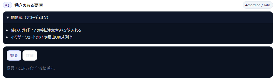
</script>#5 Accordion and Tabs (JS-less)
Because it "folds information," it keeps the screen clutter-free and is a well-suited decorative element for workspaces.
**🔶Success! **
It can be used for a wide range of purposes, such as frequently asked questions/disclaimers and small panels to switch between "Overview" and "Details."
🔷Implementation Code
<div class="mhx5-wrap">
  <details class="mhx5-acc" open>
    <summary>開閉式(アコーディオン)</summary>
    <div class="mhx5-body">
      <ul class="mhx5-list">
        <li>使い方ガイドをここに</li>
        <li>頻出URLのショートカットもOK</li>
      </ul>
    </div>
  </details>

  <div class="mhx5-tabs">
    <input type="radio" name="mhx5" id="mhx5-t1" checked>
    <input type="radio" name="mhx5" id="mhx5-t2">
    <div class="mhx5-tablabels" role="tablist">
      <label for="mhx5-t1" role="tab">概要</label>
      <label for="mhx5-t2" role="tab">詳細</label>
    </div>
    <div class="mhx5-panels">
      <div id="mhx5-p1" role="tabpanel">概要:ここにハイライト。</div>
      <div id="mhx5-p2" role="tabpanel">詳細:仕様の箇条書きなど。</div>
    </div>
  </div>
</div>.mhx5-wrap{font-family:system-ui,"Noto Sans JP",sans-serif}
.mhx5-acc{border:1px solid #e5e7eb;border-radius:12px;overflow:hidden}
.mhx5-acc summary{cursor:pointer;padding:.6rem .8rem;font-weight:700;background:#0b1220;color:#e5e7eb}
.mhx5-body{padding:.6rem .8rem;border-top:1px solid #e5e7eb;background:#0b1220;color:#e5e7eb}
.mhx5-list{margin:.25rem 0 0 1rem;padding:0}
.mhx5-tabs{margin-top:10px;border:1px solid #e5e7eb;border-radius:12px;padding:10px;background:#fff}
.mhx5-tabs [type="radio"]{display:none}
.mhx5-tablabels{display:flex;gap:.25rem;margin-bottom:.5rem}
.mhx5-tablabels label{padding:.4rem .7rem;border:1px solid #e5e7eb;border-radius:10px;background:#fff;cursor:pointer}
#mhx5-t1:checked ~ .mhx5-panels #mhx5-p1,
#mhx5-t2:checked ~ .mhx5-panels #mhx5-p2{display:block}
.mhx5-panels>div{display:none}
#mhx5-t1:checked ~ .mhx5-tablabels label[for="mhx5-t1"],
#mhx5-t2:checked ~ .mhx5-tablabels label[for="mhx5-t2"]{background:#eef2ff;border-color:#c7d2fe;color:#3730a3}
@media (prefers-color-scheme:dark){
.mhx5-tabs{background:#0b1220;border-color:#1f2937}
.mhx5-tablabels label{background:#0b1220;border-color:#1f2937;color:#e5e7eb}
}<script>
(()=>{})();
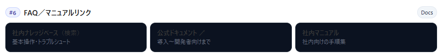
</script>#6 FAQ/Manual Links (Card Format)
A layout designed to reduce the chances of getting lost. This decoration is also effective for onboarding new members.
**🔶Success! **
It seems like it could be used for a wide range of purposes, such as frequently used company knowledge base articles, operation manuals, and standard function guides.
🔷Implementation Code
<div class="mhx6-wrap">
  <div class="mhx6-links">
    <a class="mhx6-card" href="/app/knowledge-base">
      <strong>社内ナレッジベース</strong>
      <span class="mhx6-sub">基本操作・トラブルシュート</span>
    </a>
    <a class="mhx6-card" href="https://docs.erpnext.com/" target="_blank" rel="noopener">
      <strong>公式ドキュメント ↗︎</strong>
      <span class="mhx6-sub">導入〜開発者向けまで</span>
    </a>
    <a class="mhx6-card" href="/app/web-page/user-manual">
      <strong>社内マニュアル</strong>
      <span class="mhx6-sub">社内向けの手順集</span>
    </a>
  </div>
</div>.mhx6-wrap{font-family:system-ui,"Noto Sans JP",sans-serif}
.mhx6-links{display:grid;grid-template-columns:repeat(auto-fit,minmax(240px,1fr));gap:10px}
.mhx6-card{display:flex;flex-direction:column;gap:6px;padding:.8rem .9rem;border:1px solid #e5e7eb;border-radius:12px;background:#fff;color:inherit;text-decoration:none}
.mhx6-card:hover{box-shadow:0 3px 10px rgba(0,0,0,.06)}
.mhx6-sub{font-size:.85rem;color:#6b7280}
@media (prefers-color-scheme:dark){
.mhx6-card{background:#0b1220;border-color:#1f2937;color:#e5e7eb}
.mhx6-sub{color:#9ca3af}
}<script>
(()=>{})();
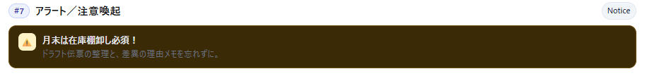
</script>#7 Alerts/Warnings (Prevention of Oversights)
This is a decoration used for things you absolutely don't want to forget, such as "end-of-month inventory count."
**🔶Success! **
It seems like it could be used for a wide range of purposes, such as monthly routines, maintenance notifications, and changes to operational rules.
🔷Implementation Code
<div class="mhx7-wrap">
  <div class="mhx7-alert">
    <span class="mhx7-ico" aria-hidden="true">⚠️</span>
    <div>
      <div class="mhx7-title">月末は在庫棚卸し必須!</div>
      <div class="mhx7-note">ドラフト伝票の整理と差異メモを忘れずに。</div>
    </div>
  </div>
</div>.mhx7-wrap{font-family:system-ui,"Noto Sans JP",sans-serif}
.mhx7-alert{display:flex;gap:.6rem;padding:.7rem .9rem;border-radius:12px;border:1px solid #fde68a;background:#fffbeb}
.mhx7-ico{display:inline-flex;align-items:center;justify-content:center;width:28px;height:28px;border-radius:8px;background:#fef3c7;color:#b45309}
.mhx7-title{font-weight:800}
.mhx7-note{color:#6b7280}
@media (prefers-color-scheme:dark){
.mhx7-alert{background:#3a2a06;border-color:#6b4f0c}
.mhx7-ico{background:#6b4f0c;color:#fde68a}
.mhx7-note{color:#e5e7eb}
}<script>
(()=>{})();
</script>#8 Embedding a demo video (YouTube)
Let's try embedding a YouTube video.
**🔶Success! **
It seems like it could be used in a wide range of applications, such as "animated highlights" for release notes or quick demos for internal use.
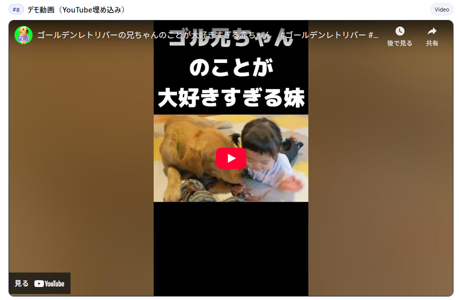
🔷Implementation Code
<div class="mhx8-wrap">
  <div class="mhx8-iframe">
    <!-- 通常横動画: 56.25%、Shortsなら 178% 程度に -->
    <div class="mhx8-ratio" style="padding-top:56.25%">
      <iframe
        src="https://www.youtube.com/embed/VIDEO_ID"
        title="Demo Video"
        allow="accelerometer; autoplay; clipboard-write; encrypted-media; gyroscope; picture-in-picture; web-share"
        referrerpolicy="strict-origin-when-cross-origin"
        allowfullscreen></iframe>
    </div>
  </div>
</div>.mhx8-wrap{font-family:system-ui,"Noto Sans JP",sans-serif}
.mhx8-iframe{border:1px solid #e5e7eb;border-radius:12px;overflow:hidden;background:#000}
.mhx8-ratio{position:relative;width:100%}
.mhx8-ratio iframe{position:absolute;inset:0;width:100%;height:100%;border:0}
@media (prefers-color-scheme:dark){
.mhx8-iframe{border-color:#1f2937}
}<script>
(()=>{})();
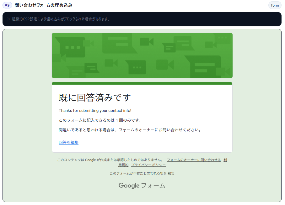
</script>#9 Embedding a contact form (Google Forms)
Let's try embedding a Google Form.
**🔶Success! **
I was able to successfully submit the survey on the website.
It's convenient for quick surveys or as a contact point for inquiries.
🔷Implementation Code
  <section class="mhx-sec" id="mhx-9">
    <div class="mhx-title"><h3 class="mhx-h1"><span class="mhx-num">#9</span> 問い合わせフォームの埋め込み</h3><span class="mhx-badge">Form</span></div>
    <div class="mhx-card" style="margin-bottom:8px;">
      <div class="mhx-note">※ 組織のCSP設定により埋め込みがブロックされる場合があります。</div>
    </div>
    <div class="mhx-iframe-wrap">
      <iframe src="https://forms.gle/Jar46DNmdENshEmV9">読み込んでいます…</iframe>
    </div>
</section>.mhx9-wrap{font-family:system-ui,"Noto Sans JP",sans-serif}
.mhx9-iframe{border:1px solid #e5e7eb;border-radius:12px;overflow:hidden;background:#fff}
.mhx9-ratio{position:relative;width:100%;padding-top:62%}
.mhx9-ratio iframe{position:absolute;inset:0;width:100%;height:100%;border:0}
.mhx9-note{color:#6b7280;font-size:.9rem;margin:.5rem 0 0}
@media (prefers-color-scheme:dark){
.mhx9-iframe{border-color:#1f2937;background:#0b1220}
.mhx9-note{color:#9ca3af}
}<script>
(()=> {
const ifr=document.querySelector('.mhx9-ratio iframe');
if(!ifr) return;
let loaded=false;
const timer=setTimeout(()=>{
if(!loaded){
const note=document.createElement('div');
note.style.marginTop='8px';
note.style.color='#ef4444';
note.textContent='フォームを読み込めませんでした。CSP設定をご確認ください。';
document.querySelector('.mhx9-wrap').appendChild(note);
}
},3000);
ifr.addEventListener('load',()=>{loaded=true;clearTimeout(timer);});
})();
</script>Conclusion
This time, I've implemented the representations of nine commonly used web applications. As a result, we were able to successfully implement everything into the ERPNext workspace.
This level of expression is possible with just a minimal custom HTML configuration.
By focusing on "easy-to-read format" + "organized user flow", your workspace can become a powerful "internal portal."
Steps to add to workspace
Steps to customize your workspace
Up to adding a custom HTML block to your workspace
I will explain it in 5 steps.
The image placement and wording may vary slightly depending on the version, but the overall flow is the same.
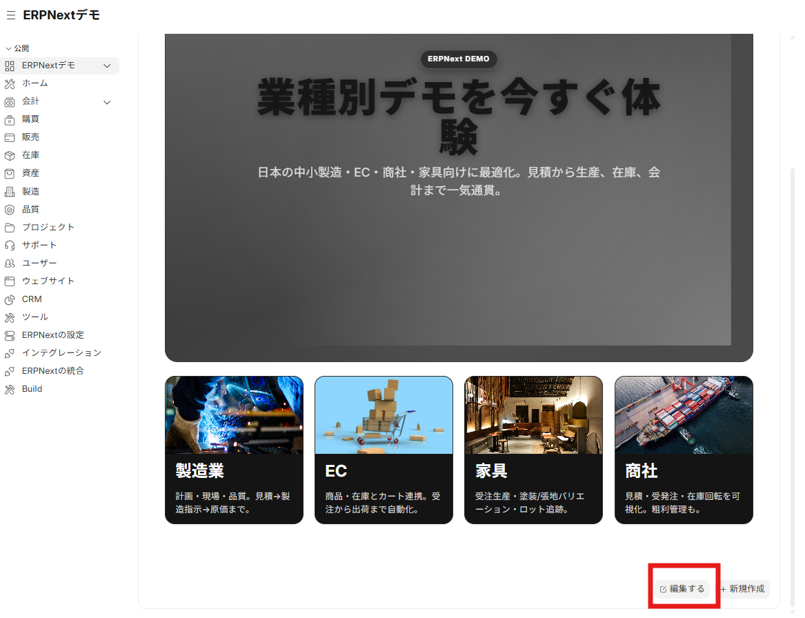
Step 1 Enter Edit Mode
- Open the target workspace and click "Edit" in the lower right corner of the screen.
- In edit mode, you can add and rearrange blocks.
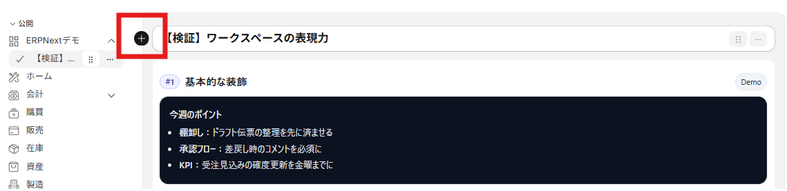
Step 2 Add a block (+)
- Click the "+" that appears near the left sidebar to open the block addition menu.
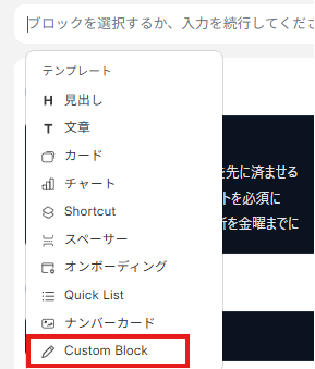
Step 3 Select a custom block
- From the menu list, select "Custom Block".
- A list of existing custom blocks will be displayed.
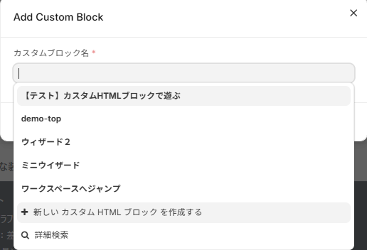
Step 4 Create a new custom HTML block
- Click "Create a new custom HTML block" below the search bar.
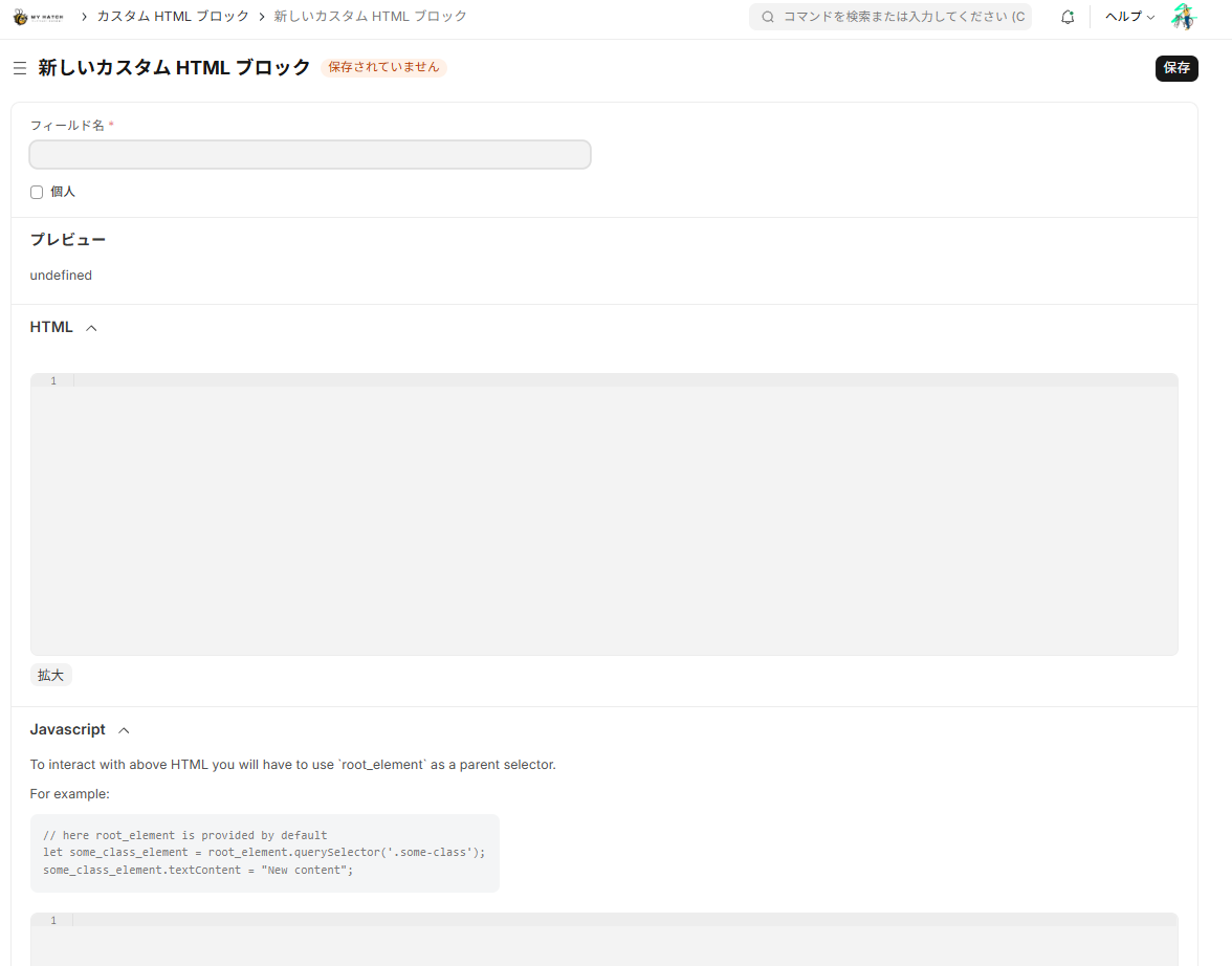
- This will take you to the block editing screen (creation screen).
Step 5 Write and save HTML/CSS/Javascript.
- The screen has input fields for HTML and Javascript.
- **CSS is
<style>…</style>It's easiest to write this in the HTML field (where you want it to override external CSS).!important(Use in combination).
summary
This time, we implemented and tested all nine types of expressions (decoration, tiles, buttons, CSS graphs, accordions & tabs, FAQ links, alerts, videos, and forms) on the workspace. The result is—
Conclusion: Everything was a success!
ERPNext workspaces allow you to create a fully functional UI using only custom HTML (+CSS).
Key Points (What we learned this time)
- In addition to standard blocks, custom HTML can be used to achieve "easy-to-read formatting," "organized navigation," and "lightweight performance."
- No scripts are required; graphs, tabs, accordions, etc. can be displayed using only CSS.
- Dark mode considerations and namespaces (
mhx-) less likely to interfere with themes or existing CSS - For situations requiring dynamic figures or advanced aggregation, using it in conjunction with Standard Charts/Reports or Client Scripts is ideal.
About the richness of expression in ERPNext
The workspace has high scalability as an "internal portal".
- Use Standard Blocks (Shortcuts/Reports/Charts/KPIs) to access “Data”.
- Use Custom HTML to customize the presentation and user experience. By combining them in a balanced way, you can recreate most of the UI elements you'll find in many web applications.
Next Step
- First, create a template for this format → then distribute it to each department's workspace.
- Where numerical data synchronization is required, connect to Standard Reports or Query Reports.
- Continuously update operational rules (alerts) and onboarding (FAQ/videos).
For those who want to try it out: **The verification screen for the implemented workspace is Here **.
- Account creation takes 1 minute and is free to try.
Related articles
 7 min
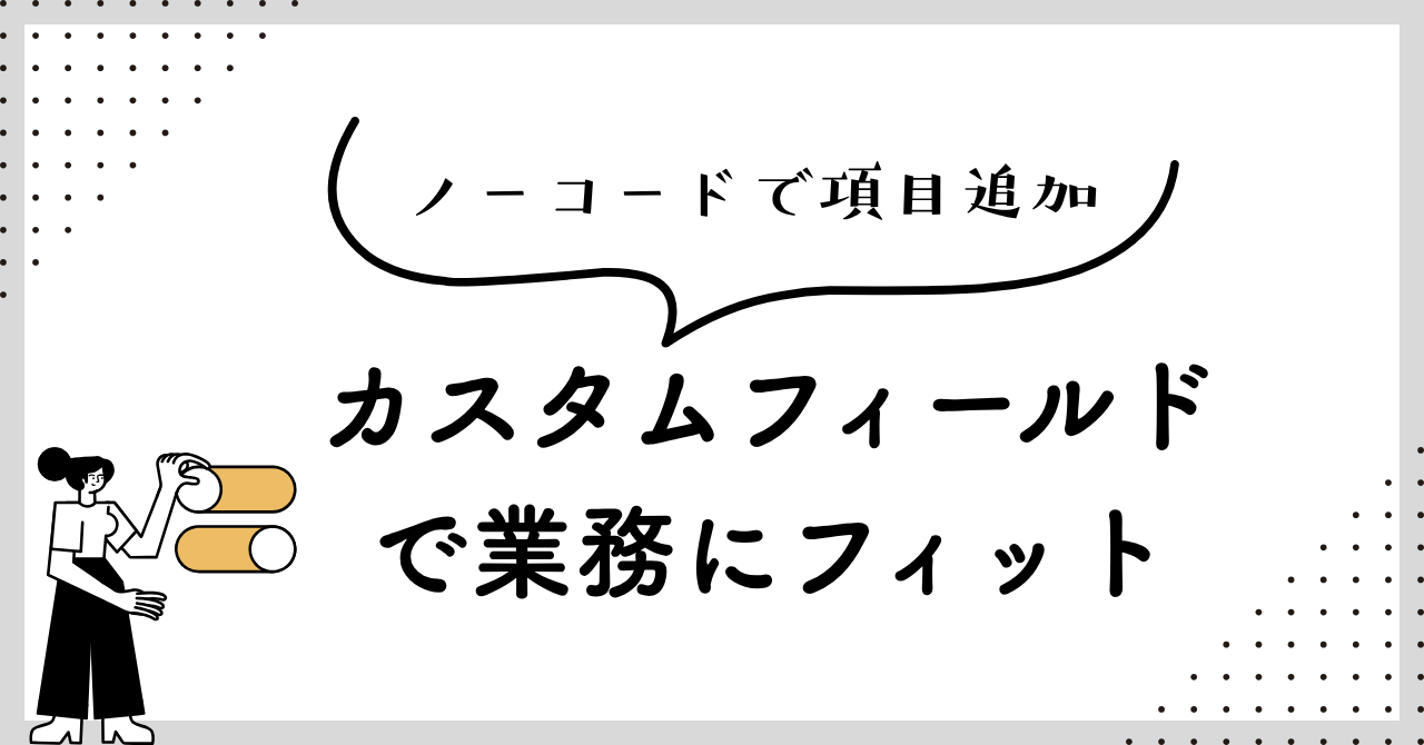
7 minAdd fields without coding — customize fields to fit your business.
This guide shows you how to add new input fields to the ERPNext screen without coding. You'll learn how to use various field types such as text, date, select, and link.
 6 min
6 minComplete control over the input screen — A guide to using client scripts
This guide explains, with practical examples, how to implement form auto-filling, display control, and validation using ERPNext client scripts. Basic JavaScript knowledge is all you need to get started.
![[Case Study 1] Workflow Approval Status Display](/images/documents/custom/workflow-panel/workflow-panel-hero-new.png) 8 min
8 min[Case Study 1] Workflow Approval Status Display
This example demonstrates how to extend workflow approval status into a custom application.