Prediction Accuracy Dashboard
A custom screen with a 3-tab configuration to visualize forecast accuracy (MAPE/RMSE). You can compare forecasts and actual results using monthly bar graphs, item-specific KPIs, and time-series charts.
Related Articles The entire prediction mechanism is Demand forecasting (AI) Monthly overview is Demand calendar Parameter management is Setting up demand forecasts See below.
What you can do on this screen
The forecast accuracy dashboard is a custom screen that visualizes forecast accuracy using a 3-tab configuration. You can monitor the accuracy of your forecasts by drilling down in the following order: Overview (monthly bar graph) → Item-specific KPI ranking → Individual time-series charts.
Screen URL:/app/forecast-dashboard
Key Indicators
- MAPE (Mean Absolute Error Rate): An indicator that shows how much the prediction deviated from the actual result, expressed as a percentage. A lower number indicates higher accuracy.
- RMSE (Root Mean Squared Error): An indicator that shows how large the deviation was.
Use it in these situations
- Review the accuracy of your predictions at the end and beginning of the month to see how accurate last month's predictions were.
- Identify item groups with significant differences and determine which items to auto-tune.
- Analyze the discrepancy between the forecast curve and actual results by overlaying them on a time-series chart of a specific item.
- Obtain an image of the accuracy report for sales managers.
How to use the forecast accuracy tab in the demand calendar
| Screen | Role |
|---|---|
| Demand calendar Prediction Accuracy tab | Review overview, compare with monthly targets |
| Prediction Accuracy Dashboard (This Article) | Independent In-Depth Dashboard: Detailed Analysis by Item |
The two are complementary and are used in a "overview → in-depth" flow.
Overall view of the screen
The screen is composed of three tabs. Using them from left to right allows you to naturally drill down from the big picture to individual details.
| # | Tab | Role |
|---|---|---|
| 1 | Dashboard | Monthly bar chart and category table by item group. Macro entry point |
| 2 | Item (SKU) | Ranking of prediction accuracy for all items. Identify items that need improvement. |
| 3 | Forecast History | Time-series charts and weekly figures for specific items |
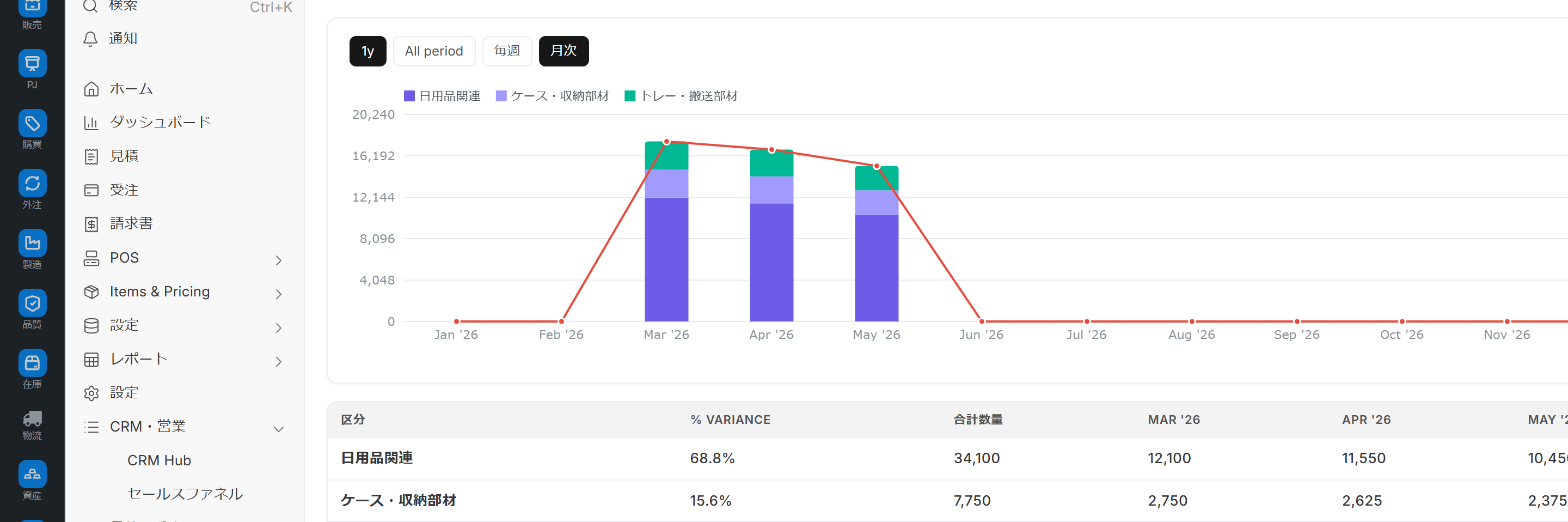
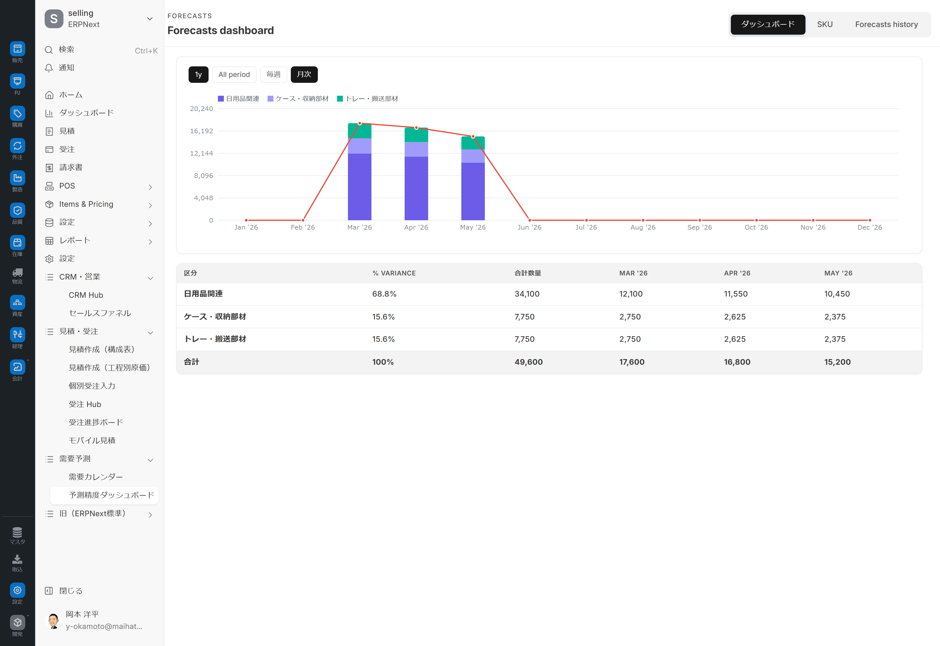
Tab 1: Dashboard (Overview)
- Monthly Bar Chart: Monthly comparison of forecast vs. actual (stacked + cumulative line chart by item group)
- Category-based Table: Variance rates and monthly actual/forecast quantities by item group.
This tab is an entry point to understand "how accurate was this month" from a macro perspective.
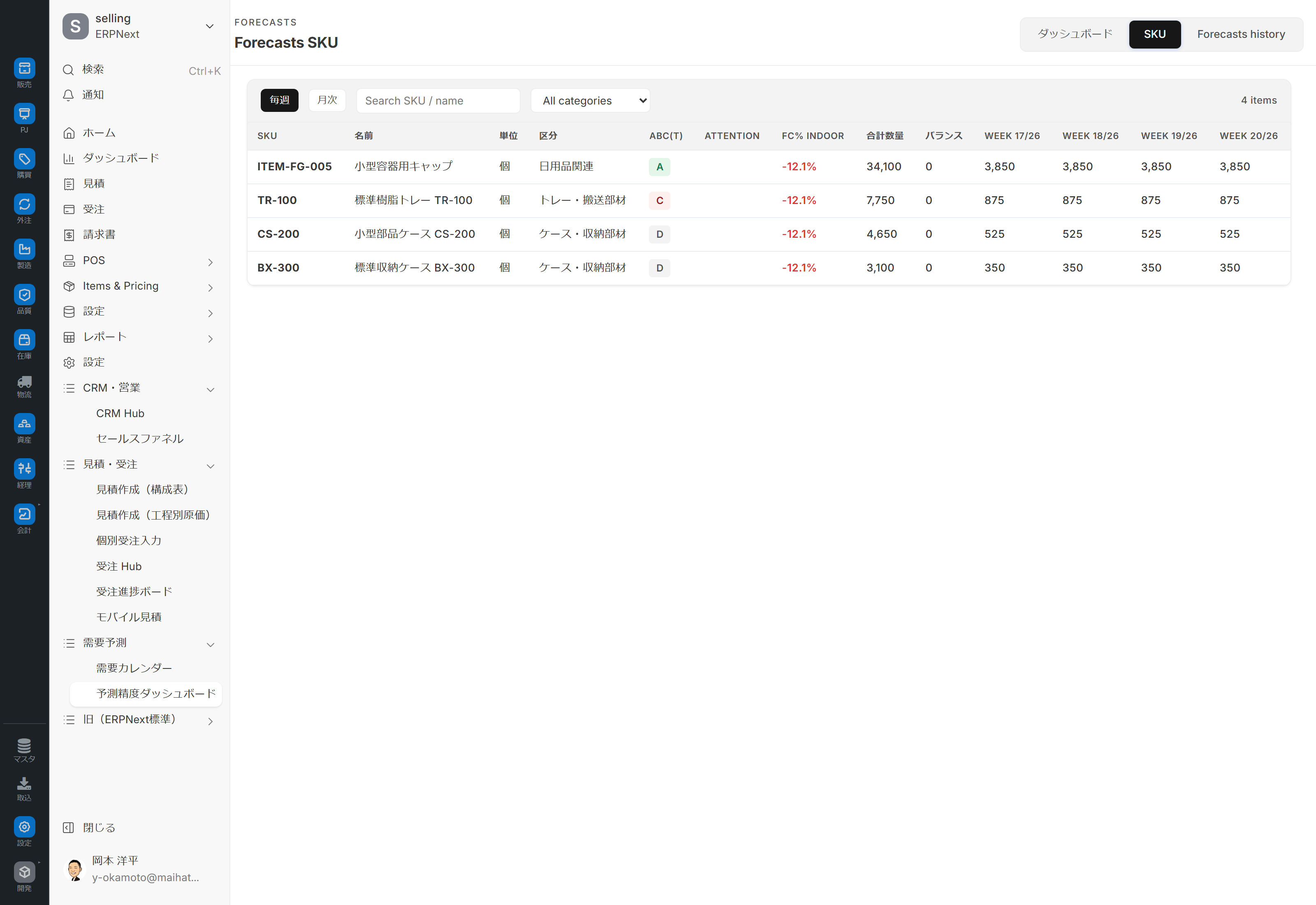
Tab 2: Item (SKU)
- Table of Prediction Accuracy Ranking for all items (Deviation Rate, Weekly Quantity)
- Item Search
- Category filtering
- Use paging to display a large number of items in separate sections.
This tab sorts items from least accurate to most accurate, allowing you to decide which items should be improved first.
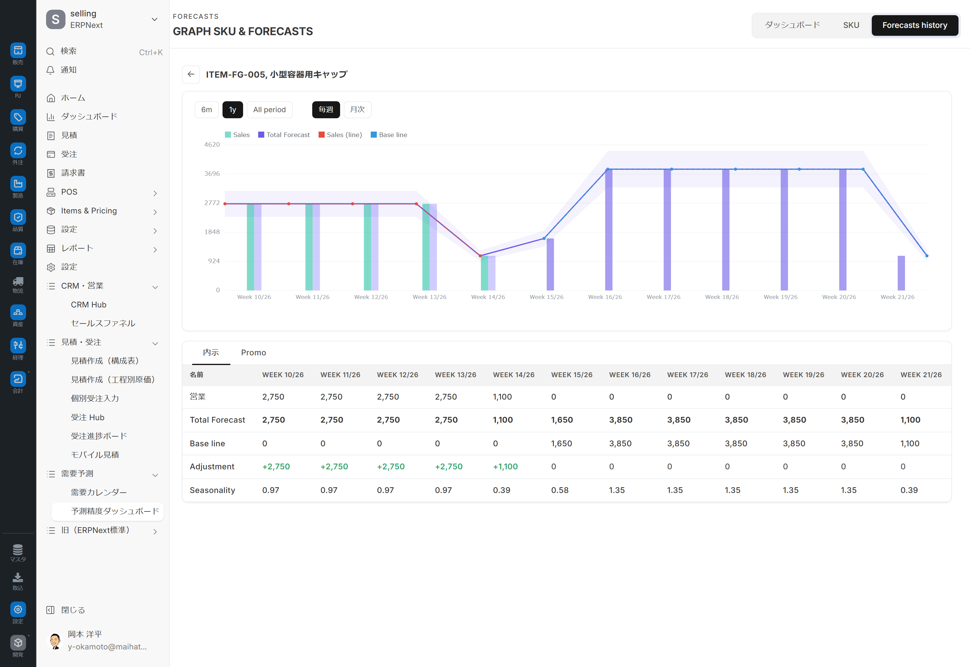
Tab 3: Forecast History (Time Series View)
- Time Series Chart: Forecast curve + actual plot for a specific item (4 series: actual / total forecast / actual line / baseline)
- Detailed Table: List of weekly figures (including manual adjustments and seasonality)
In the Item tab, drill down into the items you're interested in to identify when the prediction model went wrong.
Switching Parameters
| Parameters | Options |
|---|---|
| Time Period Switch (Item/Forecast History Tab) | Weekly/Monthly |
| Range Switch (Prediction History Tab) | 6 Months / 1 Year / All Time |
| Default Tab | Dashboard |
**
?demo=1Please do not use this: As of 2026-04?demo=1The specification has changed to launch the POS demo overlay in full screen, and the mock data for this dashboard will not be launched. For shooting and verification, please use the plain URL./app/forecast-dashboardPlease use **. The dashboard will run with actual data (past orders).
Main Operations
1. End-of-month 15-minute routine
1./app/forecast-dashboard Open (plain URL)
2. Check the forecast vs. actual results for the previous month in the Dashboard tab using a monthly bar graph.
3. Identify the item groups with high variance rates in the category-based table below.
4. Switch to the Items tab, filter by the relevant category → Extract items with low accuracy.
5. Select the item you're interested in on the Prediction History tab and identify the periods of deviation using the time-series chart.
6. Try to guess the reason for the failure (new product, sale, seasonal variation), Demand calendar Adding events will prepare us for next time.
2. Confirmation of targets for automatic tuning
Setting up demand forecasts Items that exceed the "Automatic Tuning Threshold" (default 30%) will be subject to automatic tuning. Visually check the items that exceed the threshold on this dashboard and adjust the threshold if necessary (e.g., 30% → 20%).
3. Weekly Operations (EC Forecast)
Since e-commerce forecasts change daily, we monitor their accuracy weekly by looking at the item tabs.
- In the Item tab, set the Time Period to "Weekly".
- Check the discrepancy between last week's results and the forecast.
- View the deviation trends for individual items in the Forecast History tab.
Key Indicators
- MAPE: Mean Absolute Error Rate (%). Lower values indicate higher accuracy.
- RMSE: Root Mean Squared Error. Evaluates the magnitude of the outlier.
Linked screens
| Linked to | Role |
|---|---|
| Demand calendar | Some features overlap with the prediction accuracy tab (overview) |
| Setting up demand forecasts | Enable threshold management/automatic tuning |
| Demand forecasting (AI) | Explanation of the entire system |
| Order Hub Prediction Mode | Source Data for EC Prediction |
authority
- Generally accessible only to system administrators or those with manufacturing privileges.
- Granting access to sales users requires further discussion (read-only access is sufficient for viewing purposes).
Dependent Prerequisites
- Prophet is installed. - Setting up demand forecasts The "Enable Prophet forecasting" or "Enable EC forecasting" option is ON.
- Performance data has been accumulated to the minimum number of training data points (default 14).
Points to note in the demo environment
?demo=1Do not use: As of April 2026, the POS demo overlay will launch in full screen and will not switch to the mock of this dashboard. Actual data will be referenced via the plain URL.- Check the installation status of Prophet (real-world data prediction will not work if it is not installed).
- Accuracy calculations cannot be performed if there is insufficient accumulated data (less than 14 points).
Tips for Use
- 15 minutes once a month: Incorporating this into your monthly routine at the beginning of the month will establish a consistent cycle of accuracy improvement.
- Deep dive only into the item groups with 🔴 (large differences): There's no need to look at every row; focus on the 5 item groups with the lowest accuracy.
- The prediction history tab shows "outlier periods": Visual outlier patterns are more insightful than numerical ones.
- Trust automatic tuning: Don't get carried away by short-term differences; make decisions based on monthly trends.
- New products are excluded from evaluation: Data accumulated for less than 2 months tends to result in lower accuracy.
FAQ
Q: Which should I prioritize, MAPE or RMSE?
MAPE is the primary indicator. It intuitively shows "how much it deviated" in percentage terms. RMSE is used as a secondary indicator to evaluate the magnitude of the error (the impact of outliers).
Q: Can I start automatic tuning from this screen?
There is currently no button to launch directly. Setting up demand forecasts This system automatically executes when an item exceeds a certain threshold. Manual execution is a potential future expansion option.
Q: Is the confidence interval for Prophet displayed in the time series chart on the forecast history tab?
Depending on the implementation, Prophet's standard output includes upper and lower confidence intervals, so it's highly likely that they will be displayed as bands on the chart (confirmation required).
Q: I want to change the forecast period (90 days for Prophet, 14 days for EC).
Setting up demand forecasts You can change this in the "Forecast Period (Days)" section.
Q: Aren't new products unpredictable?
For items without historical data, Prophet alone cannot provide predictions. Manual prediction input is required, referencing the historical data of similar items. Order Hub We recommend using a complementary approach (predictive mode).
Q:?demo=1 Will the demo data launched during testing affect the production environment?
In the environment as of April 2026?demo=1 This has been changed to launching the POS demo overlay, and the mock for this dashboard will not launch. **Plain URL/app/forecast-dashboard Please use ** (runs with real data).
Next Steps
- Grasp the overall picture with a monthly overview → Demand calendar
- Manual parameter adjustment → Setting up demand forecasts
- The entire prediction mechanism → Demand forecasting (AI)
- Where to reflect the predicted values in the plan → Order progress board